Having a custom gobo made for your company or special event isn’t as simple as having your logo printed as-is onto a projector slide and displaying it. Gobos have unique projection considerations that may require adjusting your visuals to produce the optimum viewing experience and enhance the message for your audience.
One particular issue to consider is whether you want a dark field or clear field gobo for your project. With a dark field gobo, the logo and visuals are surrounded by a black background, whereas with a clear field gobo, the visual elements are more like silhouettes cut out of a white background.
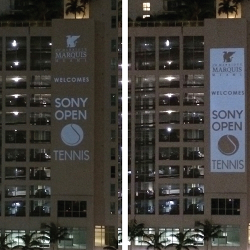
To give you a better idea of the differences between these two styles of gobo, consider a recent project we worked on with the JW Marriot Marquis hotel in Miami. The city was hosting the Sony Open of Tennis, and the hotel wanted a large projection for the side of their building to mark the occasion.
We created two gobos for the event: One with a clear field background and the other with a dark field. The latter provided a more crisp logo with better-defined edges, as clear field gobos tend to wash out the elements of a logo or image. But the clear field ended up being much more visible and attention-grabbing, as it projected more light and stood out more clearly on the side of the building.
Ultimately, the client went with the clear field gobo because they wanted the project to really stand out, even if that meant sacrificing some color accuracy and clarity.
The choice between either option depends largely on what you’re hoping to achieve with your gobo. For more information on the process involved in custom gobo design, contact Gobosource.com today!
